Forms are an indispensible part of any web application. Probably not the most loved, but it won’t be an exaggeration to say the most neglected part. Everyone is excited about the ‘cool’ stuff their app does. Taking user input, validating it and submitting it to server ( read form). Let’s just say engineers are not falling over each other to do it. We at Artoo are no different! But efficient form validation is not a problem we, or anyone, can choose to ignore.
Artoo is an Intelligent Digital Loan Origination System for financial organizations lending to small businesses. Since the borrowers have limited digital footprint, we need to facilitate data collection and analysis of their business’ profitability. Form based input is a vital part of our web app for loan processing, built using Ember. Ember is a JavaScript front-end framework designed to help you build websites with rich and complex user interactions. It does so by providing developers both with many features that are essential to manage complexity in modern web applications, as well as an integrated development toolkit that enables rapid iteration.
We have engineered our solution so that form rendering and validation logic is abstracted and does not have to be coded separately for every form. This reduces the time it takes to create or customize forms for our clients and minimizes bugs.
The essence of our solution is presented here.
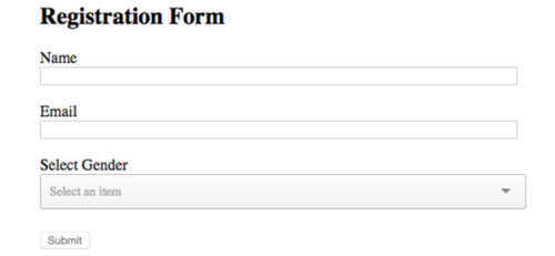
Suppose we need the following form in our app:
Our requirements: Only letters with spaces are allowed in the name field. Name should be between 5 and 20 characters.Email should be of format abc@example.com.All are mandatory fields.
Submit button should be enabled only when all fields are entered and in valid formats.
This is the general design guideline:A single common component should be used to render a particular type of field. E.g all text fields in the form should be rendered by a single text-input component.
Validation logic should be abstract.
We will make use of the Ember add-on https://www.npmjs.com/package/ember-composability in our implementation.
This is what our registration form template looks like:
{{text-input
    labelText=‘Name’
    mandatory=true
    pattern=’^[\\w\\s]{5,20}$’
    errorText=’Please enter full name’
    value=name
}}

<br>

{{text-input
    labelText=’Email’
    mandatory=true
    pattern=’^\\S+@\\S+.\\S+$’
    errorText=’Please enter valid email format’
    value=email
}}

<br>

{{select-input
    labelText=’Select Gender’
    mandatory=true
    content=genderContent
    optionLabelPath=’name’
    optionValuePath=’value’
    errorText=’Please select your gender’
    value=gender
}}

<br>

<button disabled={{disabled}}>Submit</button>
Key points: We are using the same text-input component to render name and email fields.Validations and label names are configurable.
Submit button is conditionally enabled by the ‘disabled’ flag.
Lets see how we achieve this through our components:
JS behind registration-form
import Ember from ‘ember’;

import ParentComponentSupport from ‘ember-composability/mixins/parent-component-support’;

export default Ember.Component.extend(ParentComponentSupport, {

genderContent:[ {name:’Male’,value:’male’},

{name:’Female’,value:’female’},

{name:’Other’,value:’other’}

], disabled: Ember.computed(‘composableChildren.@each.errorMessage’, { get(){ let errorElement =this.get(‘composableChildren’).findBy(‘errorMessage’); if(errorElement){ return true; } return false; } })

});
Key points: registration-form is the parent component. It has access to properties of its child components. We are using this feature to enable or disable the submit button based on errors in the child components
Content for gender selection is explicitly declared here. This could come from your server too.
The error-watcher component
import Ember from ‘ember’;

export default Ember.Component.extend({

errorMessage: Ember.computed(‘value’,{

get(){

let value = this.get(‘value’);

let errorMessage; let regex=this.get(‘pattern’);

if((this.get(‘mandatory’) && !value) \|\| (value && !value.match(regex))){

return this.get(‘errorText’);

}

}

})

});

The text-input componentJS:import ChildComponentSupport from ‘ember-composability/mixins/child-component-support’;import RegistrationForm from ’./registration-form’;

import ErrorWatcher from ’./error-watcher’;

export default ErrorWatcher.extend(ChildComponentSupport, { \_parentComponentTypes: [RegistrationForm]

});
Template HBS file:
<label> {{labelText}} </label>

<br>

{{input type=text value=value size=“80”}}

<br>

{{#if errorMessage}}

<span class=’error’>{{errorMessage}}</span>

{{/if}}
The select-input component
JS:
import ChildComponentSupport from ‘ember-composability/mixins/child-component-support’;

import RegistrationForm from ’./registration-form’;

import ErrorWatcher from ’./error-watcher’;

export default ErrorWatcher.extend(ChildComponentSupport, { \_parentComponentTypes: [RegistrationForm]

});
Template file:
<div>

<label> {{labelText}} </label>

{{ember-selectize

content=content

optionLabelPath=optionLabelPath

optionValuePath=optionValuePath

placeholder=’Select an item’

value=value

}}

{{#if errorMessage}}

<span class=’error’>{{errorMessage}}</span>

{{/if}}

</div>
Key points: We define an error-watcher component that is listening to changes to ‘value’ property. If the value entered by the user does not conform to the expected format, the errormessage gets set. 2. Both select and text input components extend from error-watcher. This gives error-watcher access to ‘value’ property set for text and select inputs. 3. select-input and text-input components use the child component support mixin and declare registration-form as parent component. This exposes the errorMessage property, used to set the ‘disabled’ flag. That’s it! Your registration form with all requirements and design guidelines satisfied is ready.
Incorrect entries will make the form look like this:
Note how the submit button is disabled. When all values are entered correctly:
No errors and ready to submit. This design also allows for propagating the values entered in the child component to the parent. More on that later.Hope this helps you with your Ember app forms!